
Venues of Transition, a conference held at LAU, organized by the Institute of Islamic Art and Architecture inviting international lecturers gathered around the topic of the Architecture in the Middle East between identity and modernity. Poster, invitation card and flyers of the program were designed conveying the feel of Islamic Art in the Middle East.
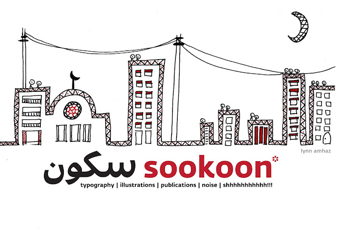
A workshop exploring the different characteristics of type in newspapers. The different weights used on a page are represented with scribbles, dark or light, scribbles that scream on the page leading the reader to dissect the information and read the most important things first, then throughout the articles. This experiment exposes the hierarchy on the page, from folios to headlines, text and captions. A second experiment explores the punctuation marks. Taking out the text and only keeping the comas, the full stops, the exclamation marks, the interrogation marks; exposes how many times the reader stops to catch his breath or to take a break. It is also a comparison between the Latin newspapers and the Arabic ones. Letters are rhythmic, but it’s the punctuation that marks the beat and the pace. A third experiment explores the characteristics of the typefaces used in Arabic newspapers. Done by replacing the space each letter occupies with vertical strokes to mark the shapes of the letters and its the ups and downs, reveals the nature of the Arabic script, it’s melody and variety. The strokes appear like pixels on a screen and even with the geometrical pattern on the page, it would sometimes remain legible! Another Arabic newspaper page was treated differently. Replacing the letters with horizontal stokes to critique the usage of such computer generated fonts that lack fluidity in comparison to the beautiful Arabic calligraphic script. The levels are reduced in order to fit more information on a single page for economic reasons; sometimes very difficult to read, and very tiring for the eye, newspaper fonts lose their character to become very stiff and digital on a printed slightly translucent page. 


A.M.S
Alstublieft - Dank U Wel
Albert Heijn
Mofa

ABC...
 A winning poster designed for the International Poster Exhibition Cancer, Hope and Life campaign organized by the career of Art & Design of San Ignacio de Loyola University. Helvetica Neue Regular and Ultra Light is the Cancer type. Each letter represents a word, strong words, no images, just letters. Expressive typography!


 The logo adaptation of the Swatch logo: The Latin Swatch is also a detached script, in lowercase, monolinear and medium weight. The Arabic Swatch is also monolinear, and medium in weight, attached but based on a Naskhi script.


