Saturday, April 10, 2010

Workshop led by Titus Ackerman Organised with Samandal

"I am interested in the personal stories of the workshop participants. Inspiration can come from anywhere: a memory, a joke, a song or a found object at the nearby flea market. Our goal is to turn it into a wordless, one page comic.” - Titus Ackerman

True Story: 1 Page - No Words - Beit Byout:


Friday, April 09, 2010

Beirut architectural guide: workshop led by Paolo Tassinari


An architectural guide to Beirut city, a group of senior graphic designers at LAU in March 2009 met with an Italian designer, Paolo Tassinari, working all together to design a publication of the multiple facets of beautiful Beirut. I worked on 3 spreads presenting the old light house, also known as Manara. In addition to that, we worked on the design of the table of contents, the impositions, the cover, the navigation system and the binding, to finally assemble all the students’ work in a coherent and consistent publication.

Fayrouz sequential posters


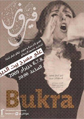
A series of 3 sequential posters that convey the feel of a modern Fayrouz, all for a same event, the first in Arabic, the second in Latin and the third in both Arabic and Latin. The grid used in the posters is very modern, the typefaces as well, the only elements that refresh the idea of Fayrouz are her old pictures, her name in calligraphy and the arabesque pattern all over the posters. Images were taken from old LP’s of Fayrouz
.

Thursday, April 08, 2010

Culture'L catalogue


Client: Jeux de la Francophonie 2009- Beirut
Culture’L is a publication that informs the reader of the upcoming events during the week of the games. From art, to sports and literature, the publication is accessible, organized and enjoyable.
In collaboration with Alya Karame

Sookoon soft cover book


Sookoon, a book that explores the musicality of the Arabic script, the rhythm, the levels, the curvatures and the melodious flow of the letterforms. It also exposes my experiments with calligraphy and the reforms in Arabic typography.

Vignelli once said, “A good typographer always has a sensibility about the distance between the letters. We think typography is black and white. Typography is really white. It’s not even black. It is the space between the blacks that really makes it. In essence, it’s like music. It’s not the notes. It’s the space between the notes that makes the music.” It’s the silence.

Sookoon hard cover book


Full stop magazine


A bilingual magazine exposing the grid whilst comparing the different elements and choices a designer would make to optically balance the two scripts. The magazine article is a summary of my thesis, it also includes a profile of the Lebanese calligrapher Samir Sayegh, and an “I LOVE ARABIC TYPE” T-shirt.

Sela: the modern revival


Sela is a digital typeface based on the Naskhi script, reviving different characteristics specific to Diwani and Thuluth, i.e. Classic vs. Modern. The edge I propose is the respect of “musicality” of the script, translated through the variations of the letterforms, the swashes, the ligatures the contrast of the pen flow, the marrying of letters with each other, along with diacritical and vocalization marks.
My typeface is based on a specific grid that I created in order to fit the modern and technical criterion. The letters have multiple heights unfolding from a baseline. However the font follows Ibn Muqla’s calligraphic systems to revive the traditional feel of Arabic calligraphy: Nizam Al Dai’ra for the overall cast, Nizam Al Nuqat for the proportions of the face, and Nizam Al Tashabuh for the uniformity of the letters.

Rakwe: Kitchen font


A typeface based on a tea kettle as a module, a font pamphlet presenting the characteristics of the typeface, the inspiration, the sketches and the digitization process, and a 3D chair based on the letter ‘ha’ of the font Rakwe.